World Cares Center -
Website Redesign
Role
UX Designer
Timeline
4 months
Key Activities
Stakeholder Interviews • Content Audit • Information Architecture • Wireframing • UI Design
Deliverables
Sitemap • High-Fidelity Designs • Design System • Developer Handoff
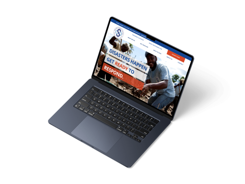
The Client's Challenge
Founded in response to the September 11 attacks, World Cares Center is a New York-based nonprofit that prepares individuals and communities to respond to disasters through training, volunteer coordination and community recovery programmes. Following changes in available funding, the organisation needed to strengthen how it communicated its services and value to secure future partnerships, funding and programme growth. Through stakeholder discussions, it became clear that the existing website no longer reflected the organisation’s priorities or supported its long-term goals, leading to a broader recommendation to redesign the site.
The Problem to Solve
Over more than two decades, the World Cares Center website had grown organically alongside the organisation. As new programmes, initiatives and resources were added, the site expanded without a strategic review, resulting in a fragmented user experience. Visitors struggled to understand the organisation’s core services, navigate the website effectively, and identify the actions most relevant to them.
The redesign focused on simplifying the information architecture, clarifying the organisation’s value proposition, and creating a more intuitive experience that better supported the needs of key audiences.
Discovery
To better understand the organisation’s priorities and the website’s structural challenges, I combined stakeholder interviews, a comprehensive website audit and navigation testing. The insights from this stage informed the information architecture and subsequent UI design.
Stakeholder Interviews
I conducted semi-structured interviews with representatives from across World Cares Center to understand organisational goals, challenges and priorities, identifying the needs of the organisation’s primary audiences.
View interview methods
- 5 stakeholders across leadership, programme delivery and marketing
- Semi-structured interviews
- Consistent discussion guide with role-specific follow-up questions
View stakeholder interview insights
-
Unclear value proposition
The website did not clearly communicate what World Cares Center does or why it matters. -
Training was underrepresented
Training emerged as WCC's strongest differentiator but was not positioned as the website's primary focus. -
User pathways were unclear
The website did not provide intuitive journeys for funders, users or partners.
Website Evaluation
To validate the interview findings, I reviewed the existing website through a comprehensive content audit and navigation assessment. This identified structural issues, opportunities to simplify the site architecture and areas where navigation could be made more intuitive.
View evaluation methods
- Content audit covering all 118 website pages
- Review of duplicate and outdated content, broken links and redirect opportunities
- Navigation pathway testing using Optimal Workshop
View website insights
-
Content duplication
Multiple pages communicated similar information, making it difficult for users to understand where to find the most relevant content. -
Inconsistent navigation
Navigation labels and page organisation had evolved over time, creating unclear pathways between related content. -
Outdated and disconnected content
Several pages contained outdated information or broken links, highlighting opportunities to consolidate content and introduce redirects.
The Design Process
The findings from discovery informed the website’s information architecture, which was then translated into design concepts and refined through stakeholder feedback before moving into high-fidelity interfaces.
Information Architecture
The information architecture was developed iteratively, beginning with an initial content map before being refined and presented in Miro for stakeholder review. Each iteration helped organise the website into a clearer structure that balanced stakeholder priorities with the needs of its primary audiences. As stakeholder discussions continued, some page names were updated to align with the organisation’s preferred terminology and future plans.
Examples from the proposed information architecture developed in Miro
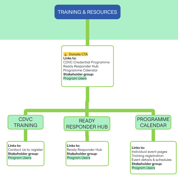
Training emerged as WCC’s strongest differentiator during stakeholder interviews. The proposed information architecture grouped related training resources into a single pathway, making the organisation’s core offering easier to discover.
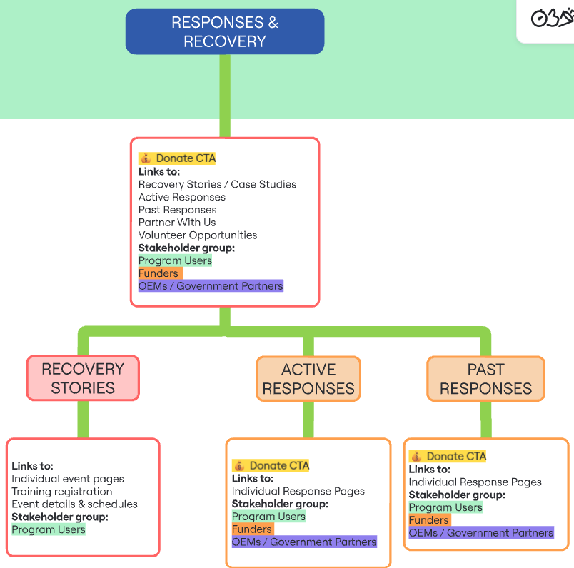
Each page was planned around three key considerations:
– the pages it linked to
– its primary audience
– opportunities to surface donation CTAs
This ensured the navigation supported both user journeys and the organisation’s fundraising goals.
Concept Development
Rather than beginning with traditional low-fidelity wireframes, I explored early design concepts to rapidly test messaging, page hierarchy and layout. Iterating on higher-fidelity concepts allowed stakeholders to react to the overall direction before the interface was refined further.
Homepage Evolution
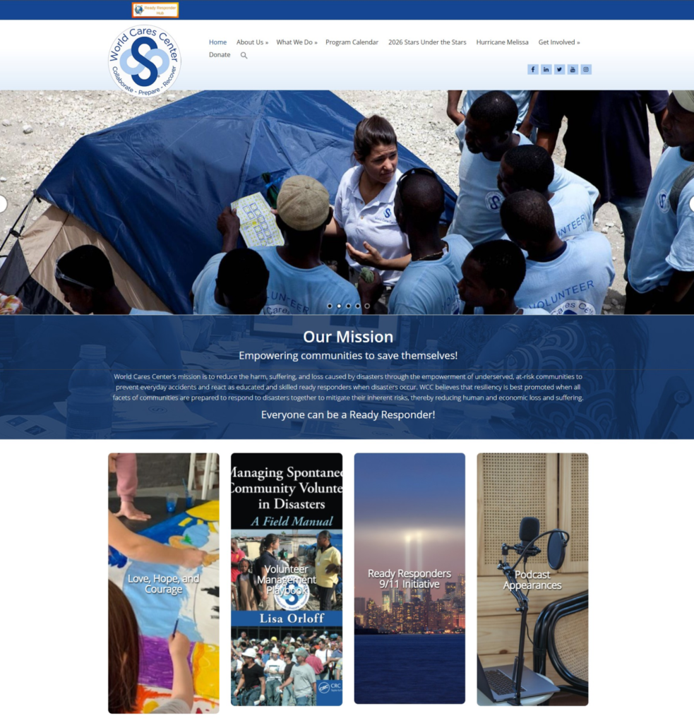
The original homepage presented several competing messages, making it difficult to identify WCC’s primary offering: disaster-response training.
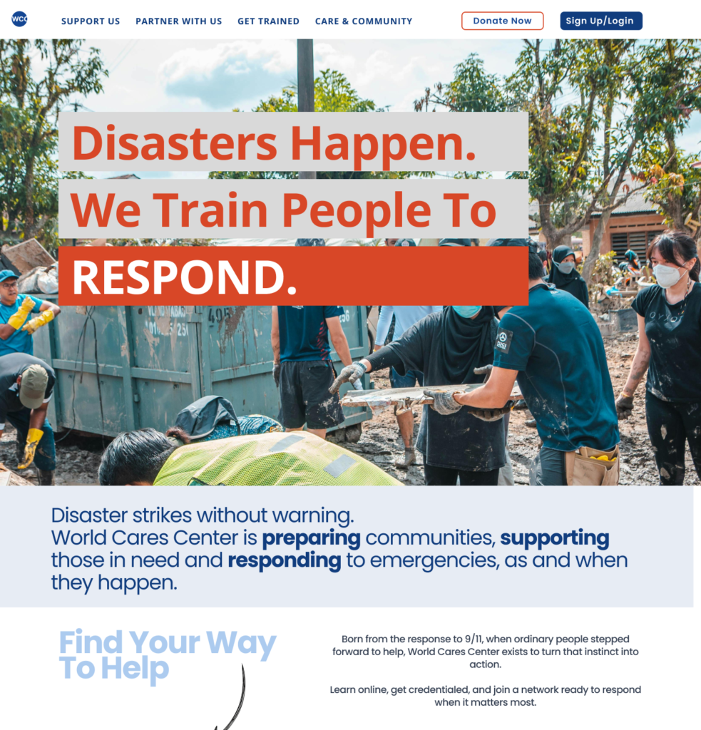
I prioritised training in the hero and simplified the navigation, creating a clearer hierarchy around WCC’s core offering.
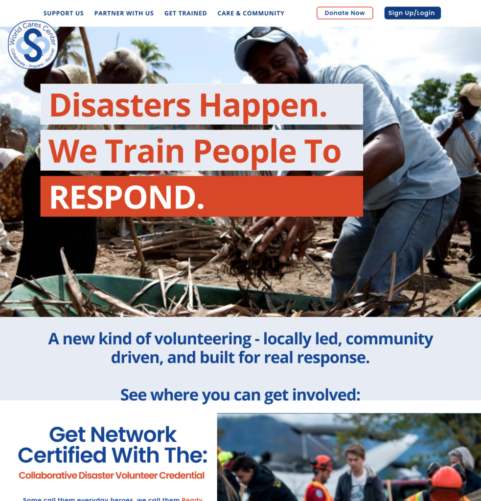
Stakeholder feedback showed that the homepage also needed to give greater visibility to community recovery. I revised the design to balance training with recovery programmes and clearer routes into each area.
Final UI
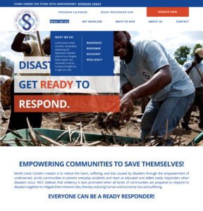
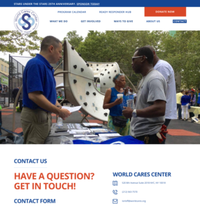
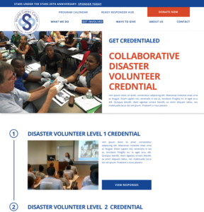
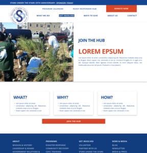
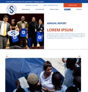
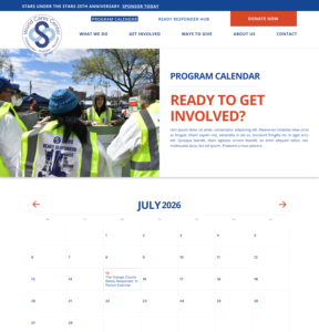
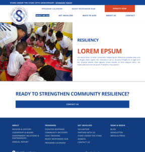
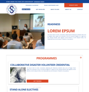
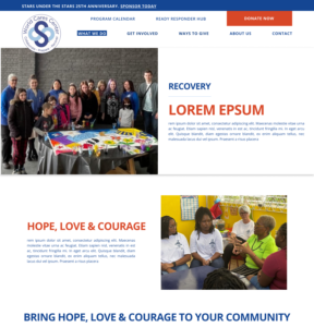
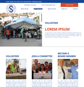
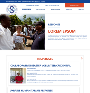
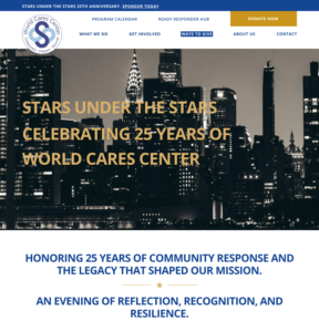
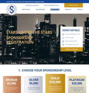
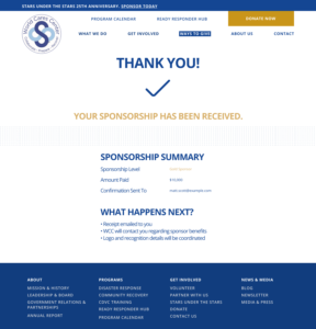
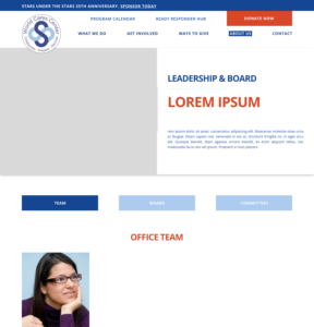
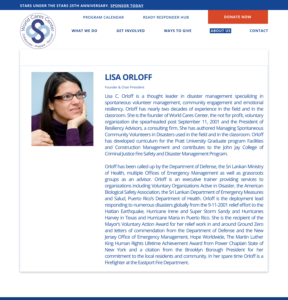
The final interface combined the validated information architecture, refined content hierarchy and stakeholder feedback into a cohesive, accessible design. Existing brand colours were retained while improving readability, navigation and the prominence of WCC’s training programmes.
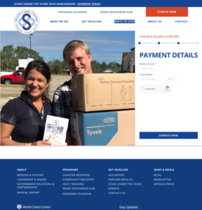
Selected High-Fidelity Designs
Design Highlights
Ready Responder messaging
The organisation’s volunteer community is built around the concept of becoming a Ready Responder. This terminology was incorporated throughout the interface to strengthen brand consistency, clearly communicate WCC’s mission and reinforce the journey from visitor to community member.
Training-first navigation
Training became the primary user pathway, supported by clearer navigation and dedicated audience journeys.
Fundraising identity
A gold colour palette was introduced to create a more premium feel, reflecting the exclusive nature of WCC’s flagship fundraising event, where sponsorships and tickets are sold at premium price points.
Outcome
The project concluded with a complete redesign proposal supported by research, stakeholder collaboration and high-fidelity interface designs. The work provided World Cares Center with a clear roadmap for reorganising its website and communicating its mission more effectively.
Deliverables
- Conducted 5 stakeholder interviews
- Audited 118 website pages
- Identified 404 errors and proposed redirect recommendations
- Developed a revised information architecture
- Produced 18 high-fidelity page designs
- Created a reusable design system
- Prepared assets and documentation for developer handoff
Key Take-Aways
As one of my first large-scale UX projects, this experience taught me the importance of structuring work before moving into visual design. It reinforced the value of clear project goals, organised documentation and a research-led process—lessons that now shape how I approach every project. Most importantly, it confirmed how much I enjoy solving complex UX challenges through research, collaboration and design, and I’m excited to apply these lessons to future projects.